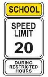
There are not many safety professionals who have been in the profession since the day OSHA came onto the scene that has not order and hung a safety sign or two. I personally believe keeping safety in the minds of the workers is a big part of keeping them safe. They have so many distractions and a well-placed sign that has concise instructions can be an effective reminder; however, a poorly designed sign with a poor message becomes wallpaper really fast. Take this sign…

Ever seen this sign before? If you are a driver I am betting you have seen these signs on more than one occasion. What are your thoughts on this sign? Effective? Is the message clear? How are you and I supposed to respond when we see this sign? Sure we know we are in a school zone and the speed limit is 20 mph, but for this message to be effective we are missing one IMPORTANT piece of data. Do you see the problem now?


